A heuristic for feeling fine
| Project Infobox | |
|---|---|
| Self researcher(s) | User:Gedankenstuecke |
| Related tools | Oura Ring, Quantified Flu |
| Related topics | |
Builds on project(s) |
|
| Has inspired | Projects (0) |
This is an on-going self-research project about using a number of physiological parameters to create a personal heuristic for whether I'm feeling fine or under the weather. It so far is mainly focused on using data from an Oura Ring and makes use of around 4 years of historic data (from November 2018 to December 2022).
Background[edit | edit source]
Over the years of using my Oura Ring I have settled into the habit of opening up the app in the morning to check my "readiness" metrics, which are mainly calculated based on the resting heart rate, heart rate variability (HRV), body temperature and respiratory rate. Despite all of these metrics being influenced by how "well" one sleeps (including body temperature[1]), I have found these to more interesting than the predicted sleep stages, sleep timings etc. A big reason for finding those metrics more interesting is that I felt that they can be quite a good predictor of how well or crummy I will feel for the upcoming day or days by looking at whether they deviate from my expected baseline or not, similar to how Quantified Flu allows one to look at outliers.
Generally having my body temperature and resting heart rate going up and my HRV and respiratory rate going down seems to signal some kind of disturbance. Disturbances can be caused by a number of things:
- Coming down with an infection
- Being jet lagged
- Drinking alcohol in the evening
- Acute stress
As I know my own context (i.e. what I did the day before) many times I can rule out many of the factors (e.g. being on vacation, without jet lag and no drinks? might be an infection coming). Over the years I feel like I've created some mental heuristics of what the "normal" range of values is I would expect and at which deviations I should at least think a bit about whether there might be something going on. For example, a rise in body temperature by 0.4 ºC or a nightly resting heart rate of over 60 bpm are borderline and to me feels like something is going on.
Questions & Methods[edit | edit source]
While those mental heuristics are nice for having an intuition, they are a bit limited as it's hard to update my own expectations of what is normal and it's nearly impossible to make a prediction that's not based on looking at individual metrics. That's why I wondered: Can I come up with a rule of thumb that can be put into code for making a better heuristic?
Given that my own mental approach was just looking at "abnormal deviations from my expectation" I decided to just go with the more statistical concept of looking at standard deviation (σ), which measures the degree to which individuals within the sample differ from the sample mean[2]. By looking at the standard deviation for those values, I can establish what the "normal" range for each of the four metrics of interest (resting heart rate, heart rate variability, body temperature) would be.
| Metric | Mean | σ | 2σ |
|---|---|---|---|
| Resting heart rate | 56 bpm | 51 – 60 bpm | 47 – 64 bpm |
| Heart rate variability | 40 ms | 30 – 49 ms | 21 – 59 ms |
| Body temperature deviation | 0.0 ºC | -0.22 – 0.22 ºC | -0.44 – 0.44 ºC |
| Respiratory rate | 14.4 /min | 13.6 – 15.1 /min | 12.7 – 16.1 /min |
Assuming a normal distribution, 68%, of all data for each of the metrics will be within the range of σ, and 95% within the 2σ range. Looking at the table above we can see that my intuition that a 0.4 ºC degree deviation of my body temperature is indeed quite significant, as it's just at the upper border of the 2σ range. In contrast, my assumption that a resting heart rate of 60 bpm would be "unusual" turns out less right, as it's just at the border of the 1σ range, meaning those are still quite common. And seeing those numbers also lets me have a rough idea of what to think of as "unsual" values for the HRV & respiratory rate, where before I didn't really have any good intuition for.
Extraordinary days[edit | edit source]
Having those ranges of what are outliers now maybe also allows looking into how to make a prediction that's not just based on an individual metric but the collective of the four metrics I think might work for this. A simple idea I had (and which will probably make mathematicians cringe and tell me off), was to "score" each day by how much each of the four metrics is an outlier. Each metric would contribute either 0 (within 1σ), 1 (value is >1σ but <2σ) or 2 (value is >2σ) to the total summed score, which can range from 0-8 given the 4 metrics.
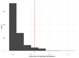
Calculating the scores for all 1,484 days I used the Oura Ring for and visualizing it as a histogram gives the image on the right. As one would expect, the vast majority of days have a score of 0, meaning all metrics are within the first standard deviation. But (as also expected), it shows that there's a small number of days that are clear outliers where scores go up to 8, and the upper limit of the 2σ the resulting distribution is a score of 3, with 123 days scores at least as large (and the 3σ boundary being a score of 4 or larger, with 61 days falling within that).
Are those scores and their boundaries useful?[edit | edit source]
Okay, so for now we've just played around with numbers, but do those scores actually mean anything? So, I went ahead and extracted all the dates with a score of 3 or higher and did some spot checks against my calendars, emails, Slack and other chat histories to see if those days were indeed days during which I probably felt not great for some reason.
And overall it worked quite well! For many of the days that I extracted that way I could find that I was either sick (coming down with a cold, having COVID, etc) or having done international trips and being jet lagged. For other days there wasn't any clear indicator in my historic records on whether I was indeed feeling not great that day, but it's hard to know if that is evidence of absence or absence of evidence. But: Once I looked at only days of score 4 or higher it seemed that the rate of finding evidence grew quite a bit.
Conclusions[edit | edit source]
Overall, this "scoring" approach seems to work in principle, even if I might have to tweak the cutoff/boundary values a bit. But what good is that score? To actually make use of it, I went ahead and updated the little script that populates my website footer, to display the overall values for the current day[3]. Which means I can now sync my Oura ring in the morning and then check my website to see what the predicted day looks like: Will I feel fine (score <3), maybe a bit under the weather (score between 3-4) and likely a bit under the weather (score >4). Time will tell if this is more useful than my own mental heuristics. Update: As I've moved from an Oura Ring to an an Apple Watch as my main wearable device, I'll have to update this approach, as the data export doesn't work in the same way.
EDIT 2023-06-08: Using historical data to "validate" approach[edit | edit source]
During one of the recent self-research chats I got inspired to use some of my existing data to explore whether it can be used to validate my heuristic to some level. Because in addition to all of my wearable data, I do happen to have around 3 years (or 1100 days) worth of self-reported symptom data through being a daily user of the Quantified Flu (QF) project.
Looking at my daily symptom reports.[edit | edit source]
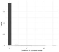
Each day at around 6pm local time I report whether I experience any symptoms of infection (e.g. cough, headache, fever, nausea, diarrhea, …). Each of these symptoms is scored as a Likert-item between 0-4. As for this validation we don't care too much for the different kinds of symptoms but rather a more abstract high-level view, we can just sum up all the symptom scores into one total score. As there is 12 scored symptoms at the moment, this gives us a daily symptom score between 0 – 48.
As seen in the score distribution on the right, those combined scores are be either zero or at least hover close to zero for the most part. And even for the extremes my values during this period never got larger than a total symptom score of 13. Overall, this distribution looks quite similar to the scores I created for my heuristic (see above).
Combining the symptom scores from QF with my heuristic[edit | edit source]
With those daily symptom scores in hand, I could now merge the data with the "feeling fine"-scores from my heuristic by just matching them on the date. This results in ~1100 combined data points for which I have both the daily symptom score as well as the heuristic prediction.
Visual validation[edit | edit source]
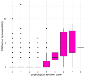
This now allows making a simple boxplot for some visual validation of the approach (see figure on the right). On the X-axis we can see the "physiological deviation" score that is calculated according to the approach outlined above. To recap, higher scores indicate a larger deviation of my physiological parameters away from my personal "norm", which I assume to indicate somehow not feeling 100% okay. On the Y-axis we see the "symptom score" – the sum of my reported symptom intensities.
If the heuristic works, then the average symptom scores should be higher on days where the physiological deviation score is higher. And broadly speaking that's what the boxplot shows. The median symptom ratings (indicated by the black horizontal bars in the boxes) are zero for days with a physiological score ≤4 but then start going up. And while the median for the symptom score remains zero at the physiological score of 4, we can already see that the distribution shifts, as the top of the box (giving the third quartile) moves up from zero.
But what we also see is that there are plenty of symptom score outliers (the points) for physiological scores between 0 – 3. These are cases where the heuristic would predict that I'm doing fine, but where I still have some symptoms. I think partially this can be explained by the fact that not all QF symptoms are limited to be present during infections/inflammations. For example, fatigue, headaches and muscle pains can come from a variety of sources and aren't limited to infections and thus might show up less in metrics such as HRV or body temperature.
Additionally, I experienced what's known as a smoker's or quitter's flu[4] when I stopped smoking in early 2023. During this the body can exhibit a lot of symptoms that look like a cold or flu, but that are just the body recovering. Curiously, most of my physiological data during that time looked quite unaffected.
Statistical validation: Permutation test[edit | edit source]
Based on the visual examination through the boxplot it looks like this heuristic might indeed be quite promising, with larger deviations on average having higher symptom counts/intensities than less-deviating days. And given that both the physiological deviation scores (by definition) and the symptom scores skew towards lower numbers it seems unlikely that this would be purely by chance. But just to feel a bit more confident in these results I decided to perform a permutation test to explore how extreme the actually observed difference between those values is[5].
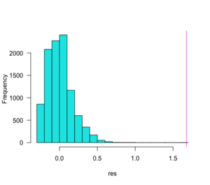
For doing this I applied the heuristic cut-off as outlined above, with physiological deviations of ≥4 being labeled as "probably somehow being sick" and values of <4 being labeled as "not sick", splitting the data set into two groups, allowing us to calculate the average difference in symptom scores between the two groups. In a permutation test one then effectively randomly shuffles the data without replacement. Doing this means that the same number of labels as sick/not sick are now randomly tacked to the observed symptom scores. From this one can now calculate how big the symptom score difference is in this random shuffle.
If we now repeat the random shuffle some hundreds or thousands of times, we can create an expectation of how often one would randomly find that the values between the two groups are at least as extreme as the actually observed difference. In the figure on the right we can see the results: The real average difference in symptom score between the sick and not-sick groups is above 1.5 (pink vertical line), and across the 10,000 random shuffles we see that the majority of score differences centers around zero (blue bars). The corresponding p-value calculated for this comes out as being tiny, with p-value: < 2.2e-16.
A validated heuristic?[edit | edit source]
Overall, I feel like this makes me somewhat more confident in the predictions given by the heuristic, in particular for the more extreme deviations (e.g. only very rarely are there cases where the score is ≥5 and I don't report any symptoms – which might also just have been me not recording properly). It's also interesting how my previously chosen cutoff of values of 4 or larger seems to be right on the borderline, with more than half of the days where a 4 is reported not having any symptoms associated. It could be interesting to explore if that assessment changes on the following day, i.e. whether the symptom report just lags by day!
Equally interesting to me are the outliers: Days where the physiological data is perfectly normal, but I still experience a lot of symptoms. It might be worth looking deeper into those days in particular!
EDIT 2023-06-15: A drifting baseline[edit | edit source]
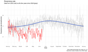
One thing I noticed during the data exports and preparations for the validation work (see above), was an impression that my respiratory rate was showing more outliers now than it used to – or than one would expect given the distribution of the data.
Plotting all of my data for respiratory rate over the course of a calendar year and for all data from 2018 – 2023 shows an interesting picture (see right): Firstly, there seems to be some an effect of seasonality, with respiratory rate typically going up during the summer and down during the winter. Some weird AI analytics startup working with wearable data found a similar trend before[6]. As my physical activity (at least as measured by steps) is constant throughout the year this might be an actual physiological/metabolic effect, which is mildly supported by a small study in India found that "vital capacity" – the maximum volume of exhaled air – is higher in winter than during summer[7].
But more relevant for that shift in outliers is that this trend does not hold for 2023, instead my respiratory rate this year is actually going down in summer! So, what's going on? I (once again) stopped smoking – since mid-February I neither smoke nor vape. And that lowering in my respiratory rate seems to coincide quite well with that time frame. It'll be worth to keep an eye on that respiratory rate and see if that lowering (by about 2 breaths / minute compared to previous years) will remain a constant effect. If so, it might be necessary to through out earlier years when calculating the baseline deviations for this heuristic!
References[edit | edit source]
- ↑ https://www.sleepstation.org.uk/articles/sleep-tips/sleep-and-temperature/
- ↑ https://en.wikipedia.org/wiki/Standard_deviation
- ↑ https://tzovar.as/
- ↑ https://www.verywellmind.com/quitters-flu-2824817
- ↑ https://mac-theobio.github.io/QMEE/lectures/permutation_examples.notes.html
- ↑ https://sleeptracker.com/ai-platform/analytics/seasonal-correlation-of-breathing-rate-and-heart-rate-through-the-night
- ↑ https://www.bibliomed.org/mnsfulltext/28/28-1562478279.pdf?1686838065
