What does clustering tell us
| Project Infobox | |
|---|---|
| Self researcher(s) | User:Gedankenstuecke |
| Related tools | Oura Ring, Fitbit, Apple Watch, RescueTime |
| Related topics | Sleep, Activity, Weight tracking, Productivity tracking |
Builds on project(s) |
100 Days of Summer |
| Has inspired | Projects (0) |
"What does clustering tell us" is a personal science project that is still ongoing and that is the result of discussions during the weekly self-research chats. The goal is to understand whether unsupervised clustering of a large number of metrics can lead to a better understanding of how different metrics relate to each other and if it shows any interesting clusters in how different days are similar to each other.
Background[edit | edit source]
The idea for doing this project came up during the spring of 2022 when discussing potential projects for the annual Keating Memorial, when some participants in the self-research chats brainstormed whether or how one could learn more from a large set of data across a number of topics and metrics.
During this discussion a suggestion was to see whether unsupervised clustering could help uncover which variables correlate with each other while also highlighting whether there are different types of days. A search in the Show & Tell archives showed that a similar approach had already been tried in the 100 Days of Summer project.
Preparing data for clustering with Principal Component Analysis[edit | edit source]
To give it a first try, I decided to go ahead and use some of my data to see if such a clustering could work using a simple principle component analysis (PCA). In order to limit the scope I decided to use data from a variety of sources. To simplify the approach, I decided to use the day as the unit of observation. For this, I either summed up or averaged measurements throughout the day, depending on the metric (see Table below).
Metrics used[edit | edit source]
A total list of 37 different metrics to be used for this work.
| Data source | Metric type | Variable | Details |
|---|---|---|---|
| Oura Ring | Activity | Daily movement | activity measured in "walking distance equivalent", single value per day |
| Steps | Number of steps taken, single value per day | ||
| Total calories | single value per day | ||
| Active calories | single value per day | ||
| Average MET | Average Metabolic equivalent of task, single value per day | ||
| inactive MET minutes | single value per day | ||
| low activity MET minutes | single value per day | ||
| medium activity MET minutes | single value per day | ||
| high activity MET minutes | single value per day | ||
| inactive time | minutes spent not being active, single value per day | ||
| low activity time | minutes spent with low activity (low MET level) | ||
| medium activity time | minutes spent with medium intensity activity | ||
| high activity time | minutes spent with high intensity activity | ||
| Sleep | Total time in bed | Includes time being awake, single value per day given in seconds | |
| Total sleep time | Total time asleep (excludes delay to falling asleep and awake time during night) | ||
| Time awake | Time awake during the night | ||
| REM sleep | seconds spent in REM sleep | ||
| Deep sleep | seconds spent in deep sleep | ||
| light sleep | seconds spend in light sleep | ||
| Time restless | Time spent moving during sleep | ||
| Sleep latency | Time difference between going to bed & falling asleep | ||
| "Recovery" / Rest | Resting heart rate | lowest nightly heart rate | |
| Average sleep heart rate | average heart rate measured during sleep | ||
| Heart Rate Variability | highest HRV measured during sleep | ||
| Body temperature delta | Nightly body temperature compared to long-term baseline | ||
| Apple Watch | Activity | Cycling distance | Total distance cycled during a day (given in km) |
| Walking + Running distance | Total distance walked / run during a day (given in km) | ||
| Fitbit | Body | Weight | Daily weight in kilogram (averaged if more than one measurement per day) |
| RescueTime | Productivity | Very distracting time | Total amount of time spent using apps classified as "very distracting" |
| Distracting time | Total amount of time spent using apps classified as "distracting" | ||
| Neutral time | Total amount of time spent using apps classified as "neutral" | ||
| Productive time | Total amount of time spent using apps classified as "productive" | ||
| Very productive time | Total amount of time spent using apps classified as "very productive" |
The data was exported from the respective sources through the Open Humans integrations. A Jupyter notebook to export all this data in a unified spreadsheet is available[1].
Processing the data[edit | edit source]
I exported data for all these variables for a time period between September 1, 2021 and June 08, 2022 as this was the period for which I felt like most data would be complete. Following the export of the data as one large spreadsheet, some more processing was needed.
Doing a PCA ideally requires a "complete" data set without any missing values. Depending on the metric, the spreadsheet generated above still had gaps in it. Some gaps were due to lack of measurements (e.g. a gap in the weight record represents me not weighing myself), while in other cases a gap means that the value should be zero (e.g. if I did not cycle at all, then Apple Health would report a data gap, but it actually represents zero kilometers cycled). To fill the table, I performed a linear interpolation of my weight for missing days, and set missing values to zero for all RescueTime entries as well as for missing cycle distance values (those categories were the only ones affected).
Running a PCA[edit | edit source]
With the full data table prepared for this time period, I ended up with 280 observations (aka days) that had full data for these 37 variables that I could use to run the PCA. For this I used the R package FactoMineR as it not only provides the basic functions for running the analysis, but also a wide set of visualization options[2]. The code for running this analysis is online as well[3]. Roughly speaking, PCAs are a way to reduce the dimensionality of data by 'rotating' the data in a way that it can be represented in fewer dimensions, ideally no more than 2-3 as this would allow visualizing it in a human-readable space. In this case, we have 37 different dimensions as given by the 37 variables and would like to boil it down to fewer dimensions without losing any information.
How do the different metrics correlate?[edit | edit source]

Running the PCA – including a normalization/re-scaling of the variables – results in the graph on the right. Doing an additional clustering by kmeans shows that there are three main groups in which the variables can be clustered:
- The top left quadrant mainly includes all metrics associated to productivity as measured by RescueTime (regardless of productivity/unproductivity category), as well as different metrics from Oura that relate to inactivity but also my cycling distance.
- The bottom right quadrant includes mainly different sleep metrics from Oura but also associated metrics such as resting heart rate and average sleeping heart rate and furthermore my weight.
- The top right quadrant includes metrics that have a 90º vector to both other clusters and mainly includes different metrics to medium & higher intensity activity. These include my overall step count as well as active calorie burn.
The axis-labels also show how much of the overall variance in my data can be explained among these two dimensions that are being plotted, which comes down to 18.5% of variance on the X-axis (dimension 1) and 13.8% on the Y-axis (dimension 2). Together, the first three dimensions of the PCA can explain around 44% of all the variance across the 37 variables.
How do the different data points cluster across the first two dimensions?[edit | edit source]
These PCA results now also allow us to look at the different data points in this new coordinate system by plotting them across the first two dimensions as a scatter plot. Before doing so I decided to use the same kmeans-clustering approach to assign each data point one of two possible labels. This clustering shows that the first automatically assigned label broadly clusters to the top-left quadrant of the PCA, towards the metrics discussed above. The second clustering is found spread out more in the top and bottom right quadrants, covering the other metrics. Interestingly, doing the kmeans clustering with three target clusters does not split this larger cluster into two, but rather leads to a third cluster that broadly overlaps with the other two.
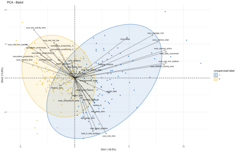
Visualizing the 280 days of data within the PCA system. Data points were clustered using kmeans to assign one of two labels in an unsupervised fashion.
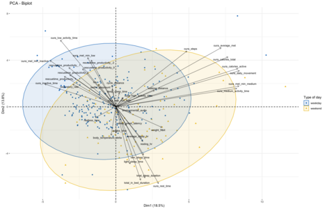
Same PCA visualization but labeling each data point by whether it is a weekday or weekend day instead.


Given that the first clustering broadly aligns with metrics related to productivity and lack of physical activity while the second is driven by sleep and physical activity metrics, I assumed that this unsupervised split might be roughly indicative of the division between workdays and weekend days. To evaluate if that is the case I decided to use weekend/weekdays as labeling for the same type of visualization as done before using the kmeans approach. Overall, this split of the data comes out quite similar, though with a bit more of overlap than seen in the kmeans-clusters. Which might make sense, as the workday/weekend labeling is an imperfect proxy for whether I followed my normal workday routine of biking to the office, working there and then going home:
On holidays and when being sick, this routine will be broken despite it being a "normal" workday as per calendar. And on some weekend days I might work from home or from the office, making this distinction fuzzy in both directions. An interesting next step might be to look at those days which change their labels between the weekday/weekend-proxy and kmeans clustering to see if these 'classification errors' might indeed result from these factors.
So what does it all tell us?![edit | edit source]
When I started this, I was mainly wondering if I would find some interesting clustering of data when doing such an unsupervised clustering of data as performed here. I did expect to find a strong effect between 'weekend' and 'weekdays' but also hoped to maybe see some more subtle differences emerge that would be less obvious to myself. It seems to turn out that at least with this simplistic approach such a more-fine grained signal (if there is one) would be drowned out by the main factor of whether it's a day in the office or not.
I tried to account for this big signal by filtering out all days which fall on weekends, but the results didn't really change overall. Coming to think of it now this seems to partially be due to the impact of homeoffice/holidays/sickness that makes a weekday filtering only a rough proxy for the routines that took place. A potential approach to account for this might be to add my Overland GPS data into the mix to see whether I went to the office or not. Generally, adding GPS data might be able to provide a strong signal beyond showing presence/absence in the office, e.g. by summing up the total distance traveled on that day or other movement metrics that go beyond walking/biking as measured by my Apple Watch/Oura Ring.
Lastly, the very strong correlation of the variables into three main clusters in the PCA is quite interesting in itself as well as how they are or aren't correlated to each other. In particular the negative correlation between the various sleep metrics and the productivity & inactivity metrics is quite interesting to see. Not only does it make some intuitive sense to me, but it is equally interesting that the medium-high physical activity variables are nearly 90º rotated away from either of them, indicating a lack of correlation between those and any other of the metrics. I'm not fully sure how to interpret it, but given the labeling of the data points it might be a sign that whether I go to work or not doesn't have too much of an effect on higher levels of physical activity, rather workdays might only influence how much inactive/low-activity time I accumulate?
References[edit | edit source]
- ↑ https://exploratory.openhumans.org/notebook/169/
- ↑ A good tutorial can be found here: http://www.sthda.com/english/articles/31-principal-component-methods-in-r-practical-guide/112-pca-principal-component-analysis-essentials/
- ↑ The R code is at the end of this notebook here: https://exploratory.openhumans.org/notebook/169/ (It won't run in the Open Humans notebook infrastructure due to some R-version issue. You will need to copy and paste it into your own R/RStudio environment).